
All About Artwork (Size, Spacing, Height, Framing, Colours, and More!)

Collection Prints | This lovely piece called “Homestead” is available as a digital, paper, or canvas print.
Artwork is one of the best ways to add colour to your home, pull a room together, and fill an empty wall. But it’s also one of the easiest things to get wrong, creating a distraction rather than a focal point. This post covers the guidelines, tips, and tricks on how to choose and hang your art correctly, so the end result is the intended result!
Size
How big should my art be?
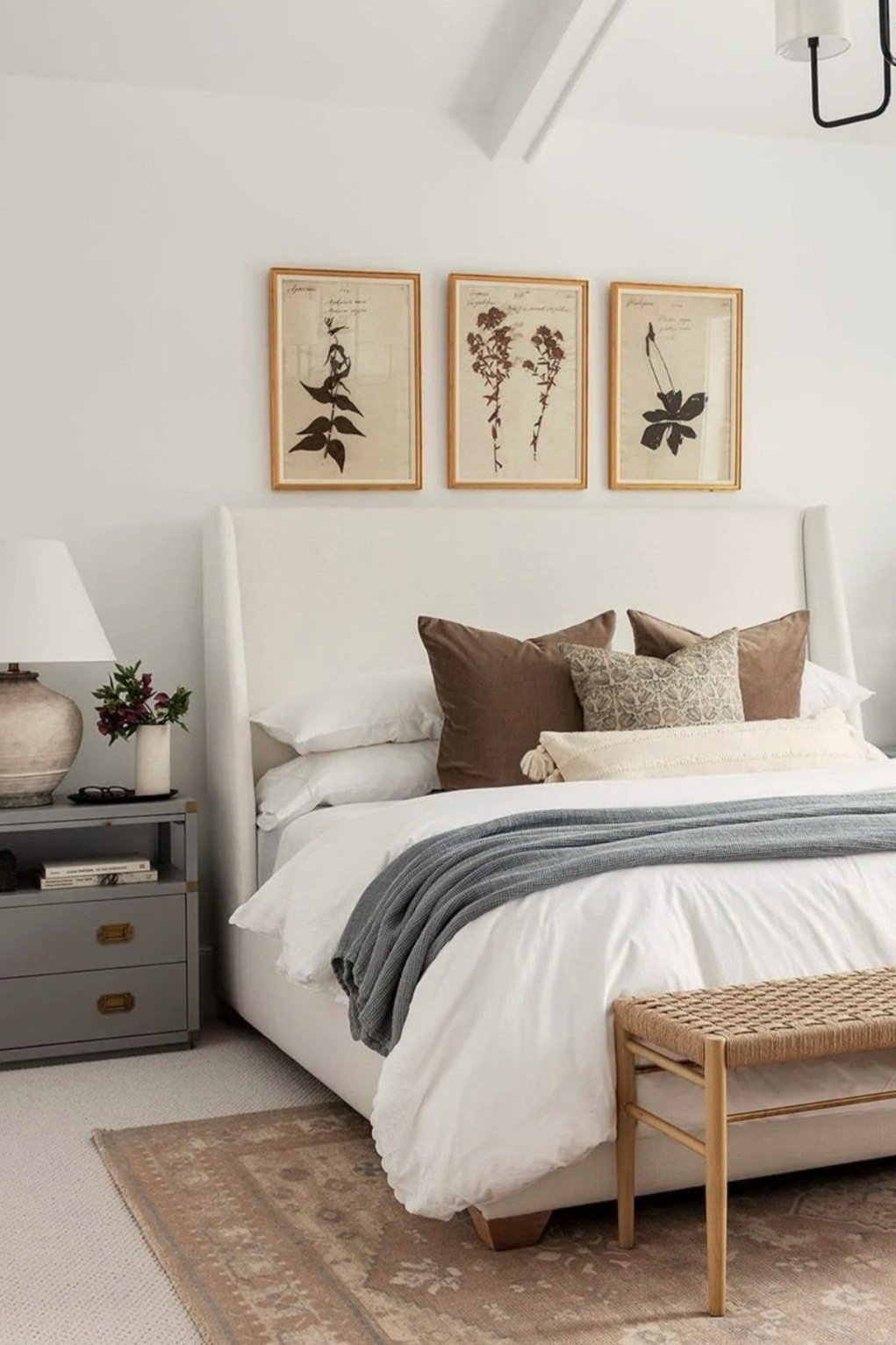
Make sure your art is BIG enough. When hanging art above something like a bed, couch, or console table, it should span about 2/3 the width of the furniture below. This can be accomplished with one big piece, or by grouping multiple pieces in a set or gallery wall.
NOTE: Cost is no longer a barrier to large-scale art! Digital printable art has made artwork more affordable and accessible than ever. 🙌
How much wall space should artwork take up?
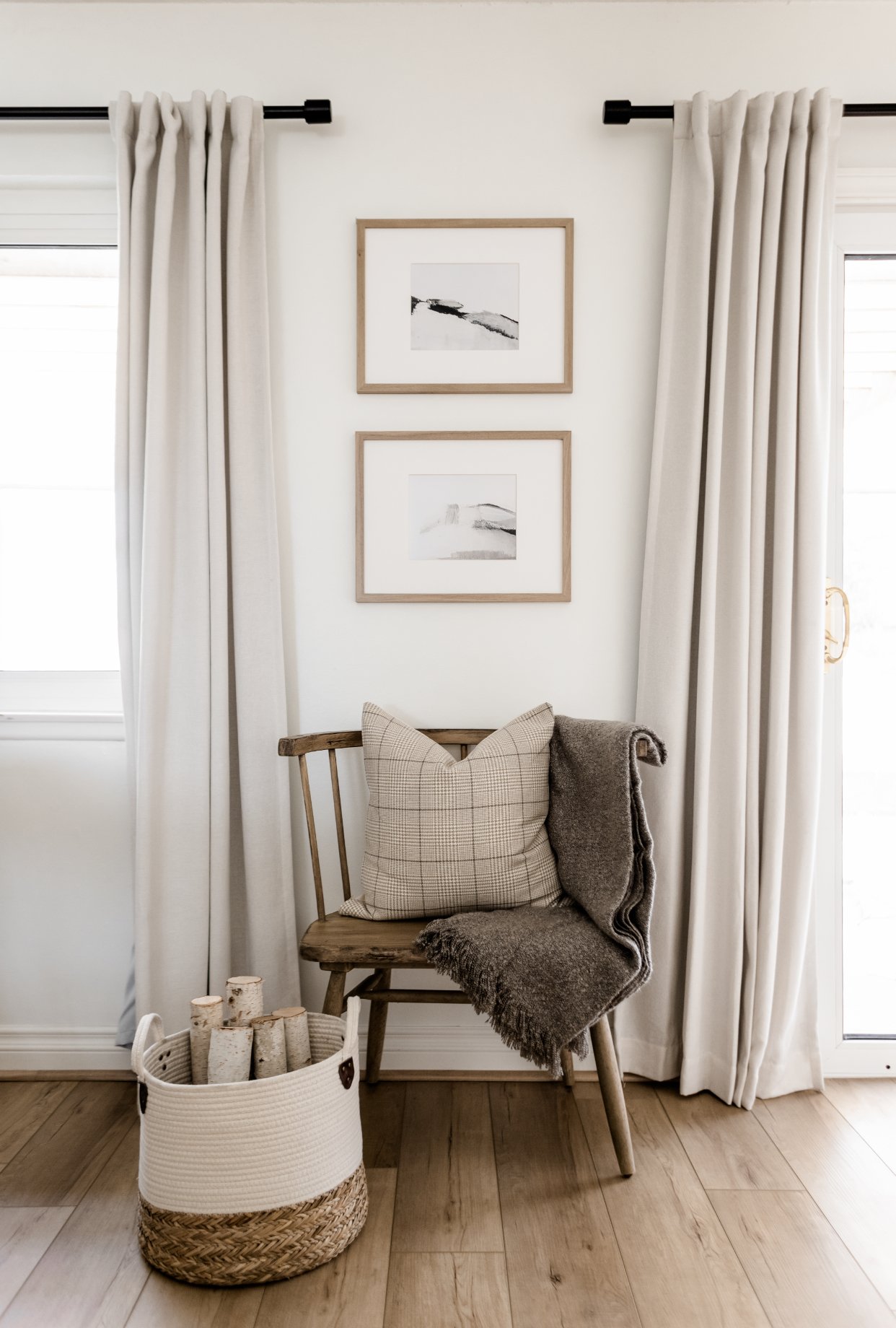
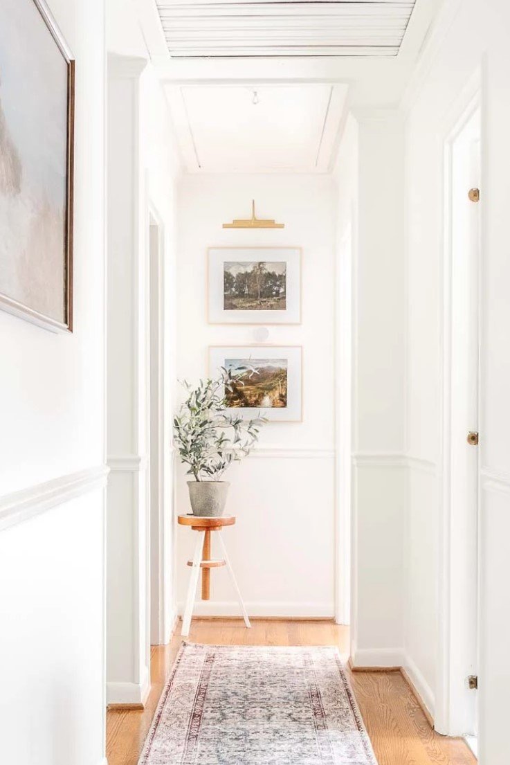
On the flip side, you don’t want your pieces to be too wide either! When hanging art on a narrow stretch of wall, e.g. between windows or at the end of a hallway, the piece(s) should ideally be just over 1/2 the width of the space you’re filling. Vertical vignettes look best in narrow spaces. Try stacking multiple pieces, hanging one long narrow piece, or adding objects below and above to fill evenly fill the space.
RELATED: How to Decorate Bare Walls
Spacing
How far apart should I hang my art pieces?

This lovely gallery wall set by Olive & Oak is nicely spaced.
When grouping multiple pieces side-by-side or in a gallery wall, they should be hung quite close together. They are FRIENDS, not awkward acquaintances! Small to medium pieces should only be about 1.5”-2.5” apart, and medium to large pieces should be about 3”-6” apart. This really depends on the pieces and the space, but when the gaps get too big, things look awkward and disconnected. This process takes a bit of eyeballin’, but when in doubt, tighten the gap!
PS — Asymmetrical gallery walls are beautiful too.
Height
How far off the floor / above furniture should art be?

The artwork is hung at a nice viewing height in this entryway by Lindye Galloway.
To admire your art with minimal neck craning, the centre of the piece should sit about 60” above the floor. This can be raised slightly for extra large pieces or super tall ceilings (or super tall people!), but regardless of ceiling height you should never hang your art too high; you want to keep it at eye level. If you have really high ceilings with lots of vertical space to fill, consider wall and/or ceiling treatments and large light fixtures!
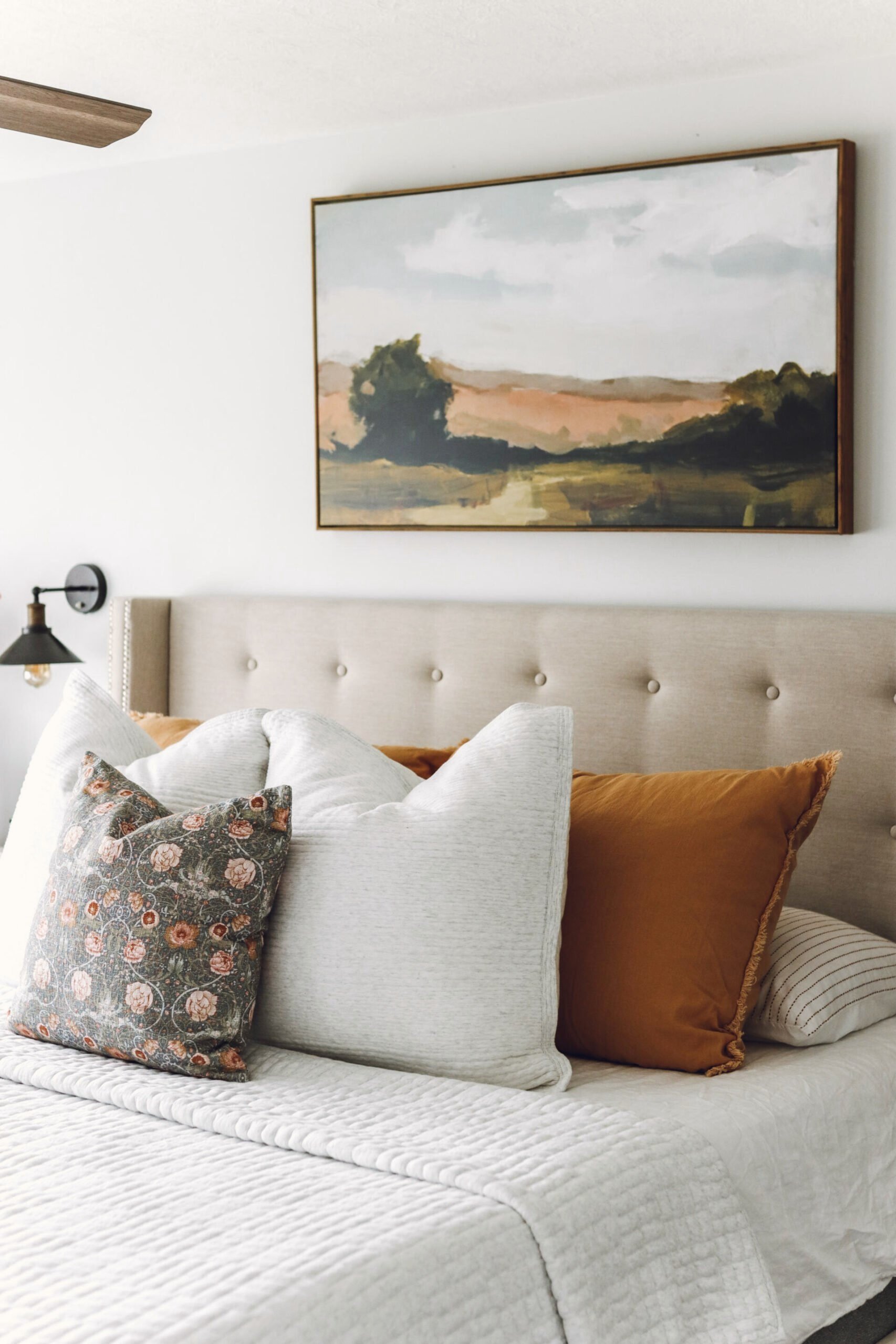
When hanging art above furniture like a bed, couch, or console table, the bottom of the piece should sit 4”-8” above the top of the furniture (the larger the furniture and art combo, the larger the gap). Large pieces of art can also be leaned against the wall, especially from taller surfaces like fireplace mantles.
Frames & Mattes
Should I frame my artwork? Should I add a matte? What colours and styles?

There are many different framing styles and techniques, as discussed by The Artling.
There’s a lot to consider when framing your artwork so I’m just gonna hit the high points:
FRAMES
COLOUR — Choose a frame colour that coordinates with your art AND your home.
BLACK frames work best with black & white photos / sketches, but shouldn’t be used if your home has no other black elements. Use white instead.
WHITE (incl. off-white, cream, etc.) is generally a safe and simple choice when matched to the “white” of your home (look to your trim, furniture, decor, etc.). Again, white shouldn’t be used if your home has no other white in it. Use wood instead.
WOOD frames are beautiful and compliment most art. Match them to the wood tones in your home and your art.
SILVER risks looking “glam” or dated, so opt for narrow frames in a brushed finish to stay outta the red zone!
GOLD frames are great in gallery walls and add an extra design element. As always, make sure the gold is repeated elsewhere in your decor.
MIXING & MATCHING — You can definitely mix and match your frames! Try switching up styles and colours throughout your home, and using a variety in your gallery wall. Just keep it to a maximum of three colours to maintain a cohesive, intentional look.
FRAMELESS — Wrapped canvas artwork looks amazing without a frame, but if you’d like to add one, a floating frame is your best bet.
MATTES
WHEN TO USE A MATTE — Mattes help increase the size of small pieces, and can provide visual relief when hanging art over wallpaper or boldly-colour walls. Mattes look best with smaller artwork. Let your larger pieces shine on their own!
COLOUR — Again, your matting has to coordinate with BOTH your art AND your home. This is especially important when choosing coloured mattes — don’t throw in a blue layer just cause it’s in the painting — that colour has to be in your ROOM too or it will just look… outta the blue! 😅
For a subtle, sophisticated look, choose the palest neutral colour that works with both the art and your room. Again, you don’t want to stark-white mattes floating in an earthy room, nor do you want a creamy matte up against a white wall. Ideally, try coordinate your matte with your wall or trim colour, a large rug, or a major piece of furniture.
Alternatively, you can pick one of your accent colours and go with bold matting, making it part of the art!
Colours
What colours should be in my artwork? Should I choose my art first or last?

This gorgeous piece by LaurieAnne Gonzalez (via Juniper Print Shop) ties together the colour palette in our apartment.
How did this get left to the end!? Last but CERTAINLY not least, let’s talk colour!
This point deserves a post of its own, but in a nutshell: the colours in your art should EITHER reflect the colours already in your room, OR contain the colours you want to decorate with (depending on where you’re at in the process). This generally means choosing art with more muted colours. Brightly-coloured pieces are eye catching, but they can be tough to coordinate with (unless A) you boldly embrace colour on your walls, furnishings, etc.; or B) you have an intentionally achromatic home in order to support lots of bold art!).
In our apartment, I had already begun building a palette of corals, peaches, and golds based on our throw pillows, then Jake threw in a curveball and demanded some green. The green duvet cover in our bedroom looked toootally random until I found this lovely piece by LaurieAnne Art to tie everything together!
Alternatively, this artwork could have been the inspiration piece for our apartment from which I pulled the corals, peaches, golds, and greens. If you’re starting fresh and don’t know what colours you want to use in your home, find some artwork you love and go from there!
PS — Finding beautiful art you love has become easier and more affordable than ever thanks to digital printable art!
RELATED: Where to Buy Affordable Artwork
Art can be tricky, but it adds so much to your home when you get it right. I hope these guidelines help you bring some colour and beauty into your space!
Related Articles


Front doors are meant to be colourful! See how a pretty coral front door breathes new life into this historical lake-front cottage.