
The Subtle Rainbow of Neutral Paint Colours
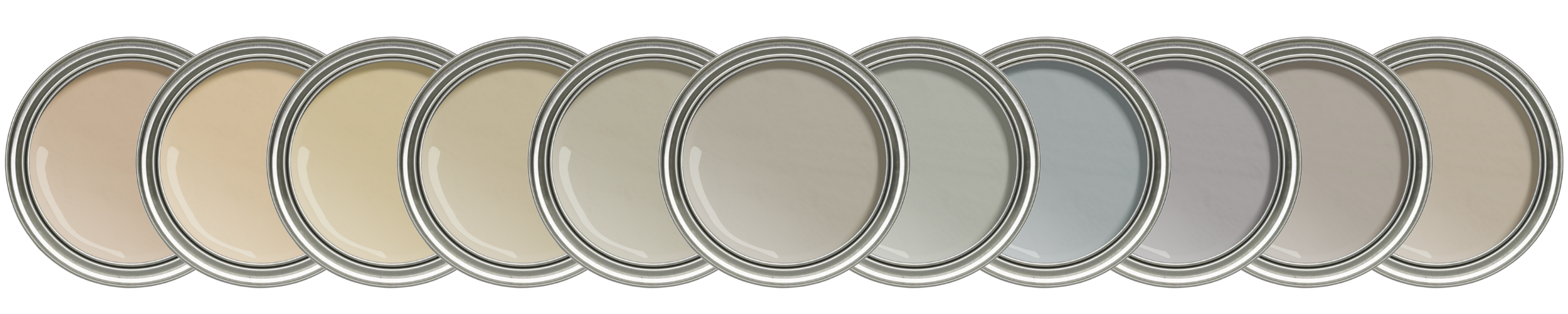
Our homes are usually full of neutral colours, from tile to carpet to backsplash and countertop. Neutrals colours often have so little chroma (colourfulness) that they seem to lack colour altogether. However, they nearly all have underlying colours which most designers and colour experts refer to as “undertones” .
Undertones come in all different colours but tend to appear in analogous groups within different neutral categories. After years of design school, colour training, and shuffling through fan decks, here’s how I’ve come to see the neutral rainbow:
BEIGE undertones range from pink (aka red) around to green.
GREY undertones range from green around to purple.
TAUPE undertones slide from purple-pink down towards green.
GREIGE undertones slide from green up towards purple-pink.
Confused? DON’T WORRY! My handy little Neutral Colour Map below illustrates the above relationships:
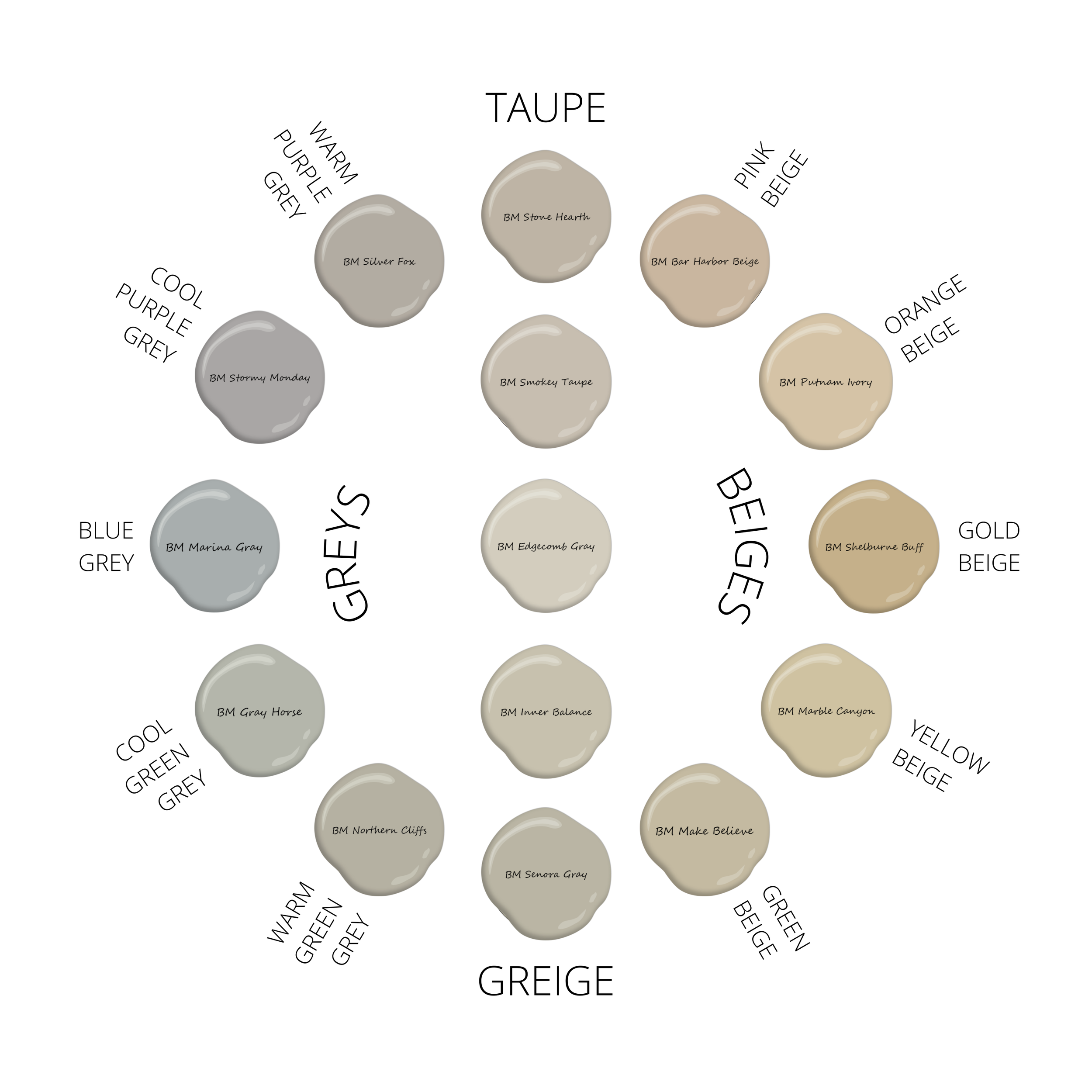
Design by Caitie | Neutral Colour Map
The colours on the map have prominent undertones so they can be easily distinguished and understood, but there are lots of beautiful, subtle options within each category. Read on for a primer of all the neutrals, along with some example paint colours for you to check out!
Neutrals & Undertones 101
Pink Beige
Pinker beiges had their heyday in the 90s, but still go well with many natural materials like linen and travertine. Lighter pink- to orange-beiges can be useful for updating Tuscan brown-trend homes, but note that pink beiges don’t pair well with other neutrals . Many factory beiges out there are in the pink (or close to) category, so beware of this when you’re buying textiles like drapery and carpeting. That said, if you love the warmth of pink beige, it can be beautiful when pulled together intentionally.
EXAMPLE PINK-BEIGES
BM Carlisle Cream
BM Bar Harbor Beige
SW Natural Linen
Behr Spanish Sand
Orange, Yellow, and Gold Beige
Orange and yellow beiges can be less distinguishable, so I usually lump them together. They’re more balanced than their warmer/pinker and cooler/greener counterparts, and go well with many natural woven materials like rattan, hyacinth, burlap, cane and sisal.
Deep gold beiges were popular through the 2000s (where they should remain buried!) and only feature on the Map for general reference.
EXAMPLE ORANGE-YELLOW BEIGES
BM Shaker Beige
BM Muslin
BM Crisp Khaki / Hemp Seed
BM Cream Fleece
BM Delaware Putty
BM Dulce de Leche
BM Hush
SW Kilim Beige
SW Softer Tan
SW Natural Tan
SW Maison Blanche
Behr Stucco Tan
Behr Natural Almond
Green & Muted Beige
The coolest of the bunch, green beige has been called the most versatile neutral. It works with many natural stones like the stacked fireplace below, and goes well with natural woven materials like jute and greyer sisals/burlaps.
I also categorize muted beiges with the greens, because even though popular colours like BM Manchester Tan or BM Clay beige don’t technically have green undertones, their lower chroma and greyer appearance can lend the occasional wink of green.

Natural stone fireplace coordinating with light green-beige walls. Reclaimed mantle & beams by Ward Harwood Flooring.
EXAMPLE GREEN BEIGES
BM Tapestry Beige
BM Grant Beige
BM Jute (could also be a greige)
BM Make Believe
SW Wool Skein
SW Grecian Ivory
Behr Alpaca Blanket
EXAMPLE MUTED BEIGES
BM Manchester Tan
BM Clay Beige
BM Lace Hankercheif
SW Accessible Beige
Greige
Definitions of greige are a bit inconsistent, but in my view (and that of the word itself, I think!), greige simply falls somewhere between grey and beige. Greige bridges the gap between warm-green-grey and green-beige, but it can also sneak up towards taupe. This is why greige paint colours are so inconsistently categorized between colour experts, such as BM Edgecomb Grey, which has been called “green-grey”, “greige”, AND “taupe” by different experts! To my eye, it’s just a lovely balanced colour righttt on the cusp of greige and taupe, which is why I plunked it smack in the middle of the colour map above.
EXAMPLE GREIGES
BM Jute (could also be a green-beige)
BM Edgecomb Grey (could also be called taupe)
BM Natural Cream / Nature’s Essentials
BM Inner Balance
BM Senora Gray
SW Useful Gray
Behr Aged Beige
Behr Sandstorm
Behr Sandstone Cliff
Behr Sculptor Clay
Warm Greys
Warms greys, which can look a little brown on the chip, favour green or purple undertones. There are no “warm” blue-greys.
Warm green-greys (pictured below) coordinate well with many natural stones and are often referred to as the “putty” or “mushroom” colours people are swooning over these days. As green-greys get warmer, they start sliding into the greige category.
EXAMPLE WARM GREEN-GREYS
BM Revere Pewter
BM Seattle Mist
BM Northern Cliffs
BM Winterwood
BM Fieldstone
SW Skyline Steel
SW Sedate Gray
Behr Pumice
Behr Grey Mist
Warm purple-greys function similarly to warm green-greys. They too can save the day if you have earthier finishes but want a cooler colour on the walls. They also go well with many natural stones like river stone. As purple-greys get warmer, they start sliding into the taupe category.
EXAMPLE WARM PURPLE-GREYS
BM Balboa Mist
BM Cumulus Cloud
BM Collingwood
BM Abalone
BM Silver Fox
SW Popular Gray
SW Alpaca
SW Requisite Gray
Behr Burnished Clay
Behr Cotton Grey
Behr Nightingale Gray
Cool Greys
Cooler and cleaner in appearance, cool greys lean from green to purple. Those with blue/purple undertones pair well with many marbles (pictured below). Because they lean into their grey base, all cooler greys can end up looking blue on the walls, especially in rooms with cooler exposures (north, east), or in climates with RELENTLESS blue-grey overcast skies (lookin’ at YOU Pacific North West!)
EXAMPLE COOL GREYS
(Green)
BM Gray Cashmere
BM Gray Owl
BM Moonshine
BM Gray Horse
SW Conservative Gray
SW Aloof Gray
SW Lattice
Behr Soft Secret
Behr Foggy London
Behr Eon
Behr Light Year
(Blue)
BM Winter Solstice
BM Silver Lake
BM Sterling
SW Gray Screen
SW Passive
SW Tinsmith
SW Zircon
Behr Halation
Behr Planetary Silver
Behr Loft Space
(Purple)
BM Cement Gray / Metro Gray
BM Stormy Monday / Silver Dollar
SW Grayish
SW Essential Gray
Behr Rock Crystal
Behr Cathedral Gray
Taupe
While greige is a mix of grey and beige, taupe is a mix of grey and brown, but it also occupies that handy “cooler than beige, yet warmer than grey” space. With distinctive pinky-purple undertones, taupe bridges the gap between warm purple-grey and pink-beige, but can also sneak down towards greige. It pairs well with some travertines and natural stones, and lighter taupes can be useful for updating 2000s era homes.
EXAMPLE TAUPES
BM Mocha Cream
BM Ashen Tan
BM Cedar Key
BM Pale Oak
BM Smokey Taupe / Inukshuk
BM Stone Hearth
BM Edgecomb Gray (could also be called greige)
SW Egret White
SW Gossamer Veil
SW Modern Gray
Behr Creamy Mushroom
Behr Smokestack
Related Articles


Front doors are meant to be colourful! See how a pretty coral front door breathes new life into this historical lake-front cottage.