
How to Identify Neutrals & Undertones
Our homes are usually full of neutral colours, from tile to carpet to backsplash and countertop (unless you’re still rockin’ that 90s teal, eh mom? 😉). Neutrals are colours with so little chroma (colourfulness) that they seem to lack colour altogether. However, they nearly all have underlying colours which most designers and colour experts refer to as “undertones” .
These pesky little undertones tend to reveal themselves at the most disheartening times — usually after spending all weekend painting, only to be exhausted (and slightly horrified) by Sunday afternoon. The good news is: you can prevent these unpleasant surprises by understanding and coordinating the colours in your space, an effort which is CRUCIAL to the visual flow of your home.
In other words:
When choosing paint colour, textiles, and other finishes for your home, it’s less about what YOU WANT, and more about what your HOME NEEDS.
The truth is, your fixed finishes and major furniture pieces really call the shots when it comes to wall colour. And it’s worth understanding this BEFORE agonizing for weeks, spending all that time and money painting, and straining your relationship till Honey wants to drown you in the paint can!
This post focusses on how to identify neutrals and their undertones so you can build consistency in your colour palette. For more help choosing paint colours, Kylie M. Interiors and Maria Killam have great blogs to guide you on your colour journey!
So what neutrals am I working with? And what are the undertones!?
Here’s the answer, plain and simple:
You identify neutral colours and their undertones by COMPARING them to KNOWN neutrals with KNOWN undertones.
Comparison really is one of the best ways to see colour clearly. I mean, most beiges look pretty darn BEIGE till you line ‘em all up and start comparing apples!
But… compared to WHAT exactly!?
Great question – one that’s never answered satisfactorily– which is why I’m writing this post!
When you compare anything in life – groceries, jeans, couches, husbands – you need something to compare them TO, and that’s precisely what you’ll find below. Read on for an overview of popular neutrals, and a list of ‘guiding colours’ that will help you see everything clearly.
Beige
Beige is a warm, orange/yellow-based neutral. Though many people are still recovering from the pink and gold beiges of the 2000s, beige is remerging in a lighter, fresher way. It looks beautiful with soft whites, creams, clays, greens, and blues – there’s SO much gorgeous modern beige out there!
Beiges range in undertone from pink (warmer) to green (cooler). Warmer beiges go well with materials like linen and travertine. Light warm beiges are useful for updating Tuscan brown-trend homes, but don’t pair well with other neutrals .
Cooler beiges towards the green end of the spectrum tend to be more modern and versatile. NOTE: some designers refer to green beige as “tan”, and some green beiges could even be classified as “greige”.
Guiding Beiges
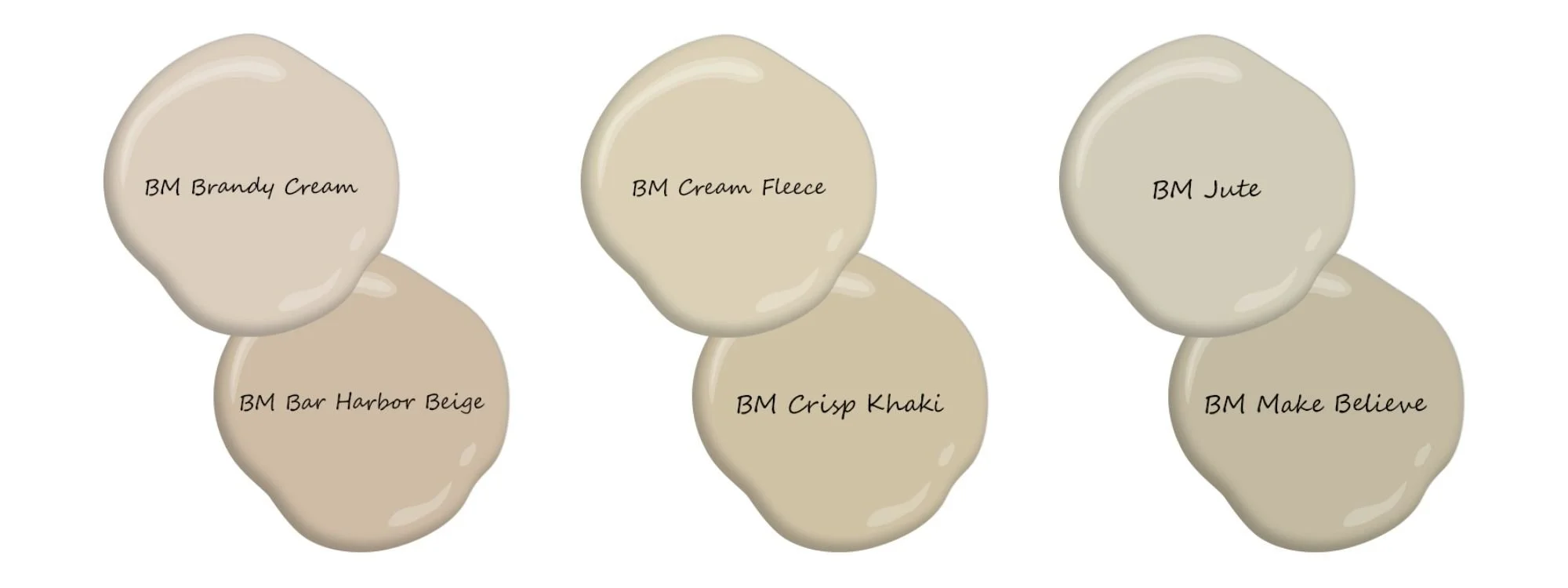
Sample beiges leaning from warmer (pinker), to mid-range (orange-yellow), to cooler (greener).
Beiges like Brandy Cream / Bar Harbor Beige are quite pink and should only be used when your fixed finishes require it. Beiges like Cream Fleece / Crisp Khaki are fairly balanced. Anything cooler than Jute / Make Believe will be firmly in the “greige” category.
The guiding beiges above offer undertone-specific reference points, but another easy way to see beiges clearly is by comparing them to a quintessential, iconic beige. Benjamin Moore’s Shaker Beige was extremely popular for many years, so it serves as a great “reference beige”. It leans a bit warm and has a pretty nice chroma (degree of colourfuless), so you’ll know to be wary of beiges that appear much more saturated.
Grey
Through the 2010s, grey succeeded beige as the go-to neutral once people started craving something cooler and more modern. (NOTE: grey has since been ousted by whites and creams!) Since true grey is simply the absence of colour, neutral (or nearly-neutral) grey paint colours do exist, but they’re rather uninspired and can look prettttty bleak on the walls. It’s better to select a grey with the right undertone, which you won’t even notice since it will coordinate with your space!.
Though greys can originate from any hue family, they tend to range in appearance from green to purple. Greys also range widely from clean & cool to earthy & warm.
Cool greys look fresh and clean, and those with blue/purple undertones pair well with many marbles. Know that all cooler greys can end up looking blue, especially in rooms with cooler exposures (north, east), or in climates with RELENTLESS blue-grey overcast skies (lookin’ at you Vancouver!).
Guiding Greys (Cooler)

Sample cool greys leaning from green, to blue (coolest), to purple.
Warm greys, which can look a little brown on the chip, favour green or purple undertones. There are no “warm” blue-greys.
Warm green-greys coordinate well with natural stone and are often referred to as “putty” colours. As they get warmer, they start sliding into the greige category.
Warm purple-greys can save the day if you have earthier finishes but want a cooler colour on the walls. As they get warmer, they start sliding into the taupe category.
Guiding Greys (Warmer)

Sample warm greys, with the green greys on the left flirting with greige, and the purple greys on the right flirting with taupe. NOTE: Seattle Mist is similar to the ever-popular Revere Pewter!
All the guiding greys above offer undertone-specific reference points, but the SIMPLEST way to see any grey clearly is by comparing it to a near-neutral grey. Since true neutral grey lacks colour altogether, it immediately reveals the comparative colour/warmth of anything placed beside it.
You should always compare colours with similar values (lightness/darkness) for the most accurate results, so I’ve included a range of near-neutral greys in the screenshot below, courtesy of the Paint Color DNA Table over at the Land of Color!
Guiding Greys (Near Neutral)
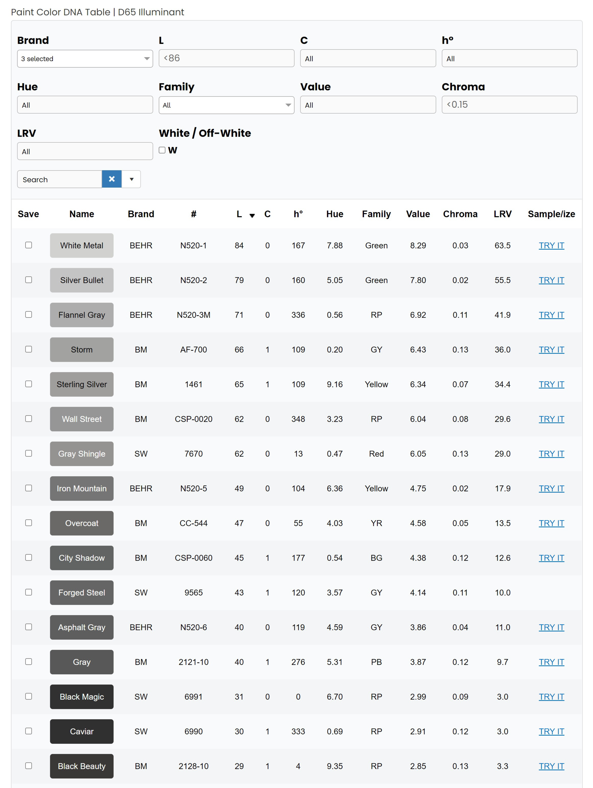
Behr, BM, and SW’s most neutral grey paint colours.
And a quick note on the other neutrals…
Greige & Taupe
Definitions of greige are a bit inconsistent, but in my view (and that of the word itself, I think!), greige simply falls somewhere between grey and beige. Greige bridges the gap between warm green-grey and green-beige, but it can also sneak up towards taupe.
Taupe is technically a mix of grey and brown, but it also occupies the “cooler than beige, yet warmer than grey” space. With its distinctive pinky-purple undertones, taupe bridges the gap between warm-purple-grey and pink-beige, but it can also sneak down towards greige.
The beige-grey-greige-taupe relationship is illustrated on my Neutral Colour Map.
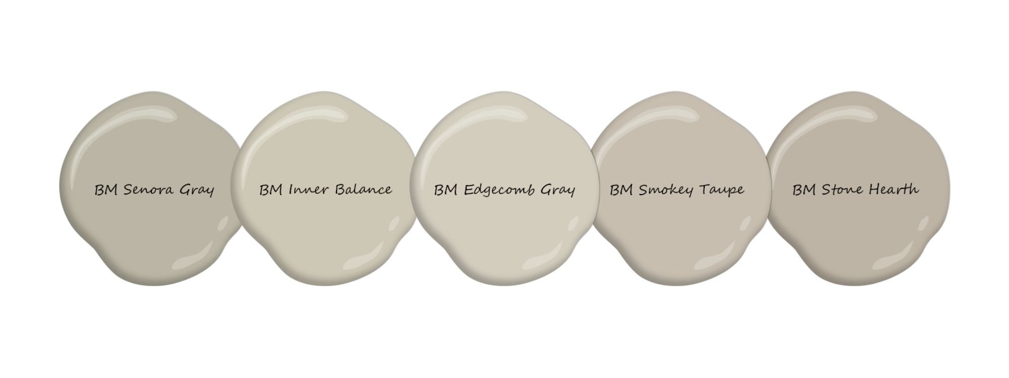
Sample colours sliding from greige on the left towards taupe on the right. Benjamin Moore’s ever popular Edgecomb Gray is a gorgeous, balanced neutral, sitting right between greige and taupe.
How to compare your neutrals to known neutrals
Now that you have a basic understanding of the neutrals, it’s time to colour match your home’s finishes and COMPARE them to the KNOWN NEUTRALS!
Step 1: You can either borrow or buy a fan deck from your local paint store. (NOTE: Benjamin Moore has many different fan decks, but I find their “Classics” and “Collections” decks most useful.)
Step 2: Take it home and start eyeballin’ some colours! Match any finishes and major furniture pieces that are STAYING, e.g. tile, carpet, countertop, backsplash, drapery, major furniture, etc. (NOTE: you can ignore your wood floor if it’s not too colourful!)
ANOTHER NOTE: finishes like tile and countertop often have many different colours running through them. For materials with distinct veining/speckling, you’ll want to identify the most predominant colours (i.e. the background colour plus the main veining/speckling colour[s]). For indistinct patterns/colouring, you want to identify the “overall impression” colour (i.e. if you could only describe the finish using one colour, what would it be?)
Step 2B (Optional): Purchase a colour measuring device like the ColorReader, Color Muse, or Nix.
Scan your finishes and furnishings to get you pointed in the right direction. (NOTE: Some people swear by these devices, but I don’t find them very accurate – especially on multicoloured surfaces.) Cross reference the results with your fan deck until you find the closest matches possible.
Step 3: Make a list of the colours that most closely match your finishes and furnishings, then go pick up those paint chips from your local store. (Don’t forget to pick up the BM paint chips of the known neutrals listed above if you haven’t grabbed them already!).
Step 4: Return home and compare the colour chips of your finishes and furnishings to the colour chips of the known neutrals, and VOILA – your neutrals and their undertones will reveal themselves! You’ll also have reference chips for all your future shopping.
So there you have it folks! Remember, your home’s finishes may not perfectly match the known neutrals (sadly I’m not magic… my letter is STILL lost in the mail…). After all, they are just guidelines, showing you which colours and undertones are closest to your finishes and furnishings. But once you know what you’re working with, it’s SO much easier to coordinate your palette and design a cohesive home!
Related Articles


Front doors are meant to be colourful! See how a pretty coral front door breathes new life into this historical lake-front cottage.