
James Hardie Statement Collection Overview & Paint Colour Matches
Are you wondering which paint colours most closely match the standard JH siding colours? Or are you planning to install new HardiePlank but can’t decide on a colour? If you’re down to the final two or three choices (after considering your home’s neighbourhood, architecture, and other fixed elements), then it’s time to start SAMPLING!
Proper sampling is a CRUCIAL step in colour and finish specification. There are several tricks to doing it right, but one of the most important steps is to use large-scale samples so you can properly see and compare your choices.

James Hardie | The JH Statement Collection colours vary slightly by region, so make sure your location is set while visiting their website.
You can order 4 x 6 samples of from the JH website, but I also recommend using large paint colour swatches. Though the following BM and SW colours aren’t perfect matches for the JH Statement Collection colours, they’re close enough to help you see which option(s) work best for your home!
You can buy sample pots from Benjamin Moore or Sherwin Williams, or grab pre-painted swatches from Hello Paint or Samplize. (TIP: if you’re working with a designer, they can order colour swatches for you directly from BM, SW, or Material Bank!)
Arctic White

James Hardie | Arctic White plank siding and board & batten.
Arctic White is a greyed-down, cool off-white with subtle blue-green undertones. Though whites are notoriously difficult to match, it’s very similar to BM OC-55 Paper White, or SW 7063 Nebulous White.
But don’t let this put you off! Since exterior colours look SO much lighter and brighter in full daylight exposure, AW looks totally bright, fresh, and crisp once installed. It’s also a good match for standard vinyl windows.
Arctic White looks great on many homes styles, and it’s super a popular choice for the trending modern farmhouse. It’s also JH’s most popular trim colour, and pairs well with many of the Statement Collection siding colours.
Cobble Stone

James Hardie | Cobble Stone plank siding.
Cobble Stone is a lovely pale greige, very similar to SW 1015 Skyline Steel.
It’s a timeless and versatile neutral that looks suits many home styles. It looks great with Arctic White trim, or you can pair it with Cobble Stone trim for a subtle, tone-on-tone look. Cobble Stone pairs really well with most brick, and can accommodate a wide range of front door colours!
Navajo Beige

James Hardie | Navajo Beige straight-edge shingles and plank siding.
Navajo Beige is a light yellow-beige, very similar to SW 6155 Rice Grain.
It suits more traditional homes with warm roof colours, and pairs well with earthy exterior stone.
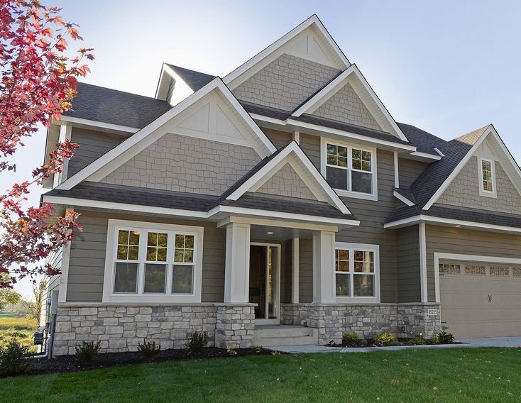
Monterey Taupe

James Hardie | Monterey Taupe plank siding and shingles. This home would look better with cream / pale beige windows and trim.
Contrary to its name, Monterey Taupe is actually a warm green-grey, lacking the pinky/purple undertones more characteristic of taupe. It sits right between SW 7052 Gray Area and SW 9172 Studio Clay.
Because it’s so muted and earthy, Monterey Taupe will limit your front door and accent colour options. Notice how this home seems to clash with the flowers because they’re so much brighter and more colourful!
That said, if you’re working with earthy, green-grey stone, Monterey Taupe may suit your home beautifully. Notice how well coordinated the stone, siding, and front door are in the image above. 👌 (Also notice how the white trim is too bright and stark. Cobble Stone trim (if available) would be better, or a custom colour.)
Khaki Brown

James Hardie | Home edited to demonstrate Khaki Brown plank siding with Cobble Stone gable shingles.
Khaki Brown is a mid-tone taupe close to SW 7513 Sanderling.
It’s a little less limiting than Monterey Taupe and can pair nicely with deeper green, blue, or even violet accents. It’s a little dated and is never my first choice, but if you’re working with warm, earthy, 2000s stone, Khaki Brown is worth sampling.
Timber Bark

James Hardie | Timber Bark plank siding and straight-edge shingles.
Timber Bark is a cool brown with subtle green undertones, close to SW 7033 Brainstorm Bronze.
Browns dominated the 2000s Tuscan / brown trend, and are best left behind in my humble opinion! If your heart is set on a neutral, consider one of the lighter options on this list so your brand new siding doesn’t instantly date your home.
Pearl Gray
James Hardie | Pearl Gray plank siding and straight-edge shingles with Arctic White trim.
Pearl Gray is a lovely, warm violet-grey similar to BM 2111-50 Stone Harbor.
It looks great on many architectural styles, and the shingles look particularly good on coastal homes. It can also help update the look of violet-grey stone from the 2010s.
Light Mist

James Hardie | Light Mist straight-edge shingles with Arctic White trim. It does have a green-blue undertone, but it doesn’t usually present this strongly.
Light mist is a light, blue-green grey, similar to BM 1481 Half Moon Crest.
It looks great paired with white trim, and just like Pearl Gray, Light Mist shingles are lovely on traditional and coastal homes.
Gray Slate

James Hardie | Gray Slate plank siding with Arctic White trim.
Gray Slate is a cool mid-tone grey with blue-green undertones, close to SW 7067 Cityscape.
Greys like this took the 2010s by storm and weren’t even a great choice back then, often looking flat and uninspired. The grey trend duped many homeowners into sad grey homes, inside and out! Even considering the stone skirt, this house would have looked so much nicer in Cobble Stone.
Night Gray
James Hardie | IMG 1: Night Gray panels with EasyTrim. IMG 2: Night Gray plank siding with Arctic White trim.
Night Gray is a charcoal grey with blue-violet undertones, similar to BM 1616 Stormy Sky or SW 7075 Web Gray.
Dark neutrals are hard to pull off and are generally better suited to modern homes (IMG 1). They look best supported by lots of greenery and landscaping, plus warm wood accents to balance cool neutral (though ideally not quite as orange-toned as the wood above!).
Boothbay Blue
James Hardie | Boothbay Blue plank siding with Arctic White trim. PS a yellow door would look great on this home!
Boothbay Blue is a lovely, muted green-blue, similar to SW 6235 Foggy Day. In real life it’s a little milder than it appears in the photo above.
It suits almost every style of home and pairs well with either Arctic White or Cobble Stone trim. For a subtle, two-toned look, try pairing it with Evening Blue.
Evening Blue

James Hardie | Evening Blue plank siding and board & batten, with Boothbay Blue shakes in the gable.
Evening Blue is a deep, muted green-blue, similar to SW 6236 Grays Harbor.
The darker version of Boothbay Blue, it also suits virtually every style of home and works with either Arctic White or Cobble Stone trim. I typically steer away from two-toned exteriors, but combining BB and EB is a lovely, understated combo.
RELATED: The Best James Hardie Statement Collection Colours
Aged Pewter
James Hardie | Aged Pewter plank siding with Cobble Stone staggered-edge shingles.
Aged Pewter is by far the warmest mid-tone grey in the collection, similar to SW 7019 Gauntlet Gray.
As with the other mid-tone and dark greys, Aged Pewter isn’t my first choice for a siding colour, but if you really want something darker and are limited by brick or stone, the warmth of Aged Pewter may work well on your home.
Iron Gray

Craftsman’s Choice | James Hardie Iron Gray plank siding in varying widths.
Iron Gray is the darkest colour available in the Statement Collection. It’s a deep, charcoal gray with a green undertone, similar to SW 7062 Rock Bottom.
Like all dark neutrals, Iron Gray works best on modern homes with lots of glazing, surrounded by ample greenery and landscaping (which this home above could use more of). With its hint of softness and earthiness, Iron Gray a great alternative to black while still working well with black windows.
Deep Ocean

James Hardie | Deep Ocean plank siding with Arctic White Trim.
Deep Ocean is a deep navy blue similar to BM HC-154 Hale Navy.
It works on many housing styles, but looks best with lots of light trim to balance out the depth (though this white trim is a bit too high contrast… try pairing it with Cobble Stone or a custom off-white instead.) It’s also one of the few colours that pairs well with red brick.
Mountain Sage
James Hardie | Mountain Sage plank siding
Mountain Sage is a deep, mossy green similar to BM 1498 Forest Floor.
It looks great on many different home styles and pairs well with Cobble Stone trim for a softer look. Greens like this were popular in the 2000s paired with beige and deep reds, but it still looks perfectly timeless on this sweet house with no earthy stone and a fun coral door!
Countrylane Red

Countrylane Red plank siding.
Countrylane Red is a deep muted brick colour, similar to BM 2104-30 Harvest Brown.
Red houses aren’t for everyone, but it’s definitely a classic and timeless look if you love it! Muted, earthy reds like this work best on more traditional homes.
Rich Espresso
Global Home Improvement | James Hardie Rich Espresso board and batten.
Rich Espresso is a deep, cool brown with violet undertones, similar to SW 7020 Black Fox.
No matter how you spin it, brown just looks old. It was so overused through the 1970s and 2000s that it instantly makes your home look dated, so as with Timber Bark, I would stay away from Rich Espresso and opt for a lighter neutral or colour!
Even though this siding job was nicely done, this home does not look refreshed and updated which is (usually!) one of the primary goals when redoing your exterior.
And that’s a wrap on James Hardie’s Statement Collection colour matches! I hope this list helps with your sampling and selection process, but check out my design services if you’d still like a colour consultation.
Related Articles


Front doors are meant to be colourful! See how a pretty coral front door breathes new life into this historical lake-front cottage.